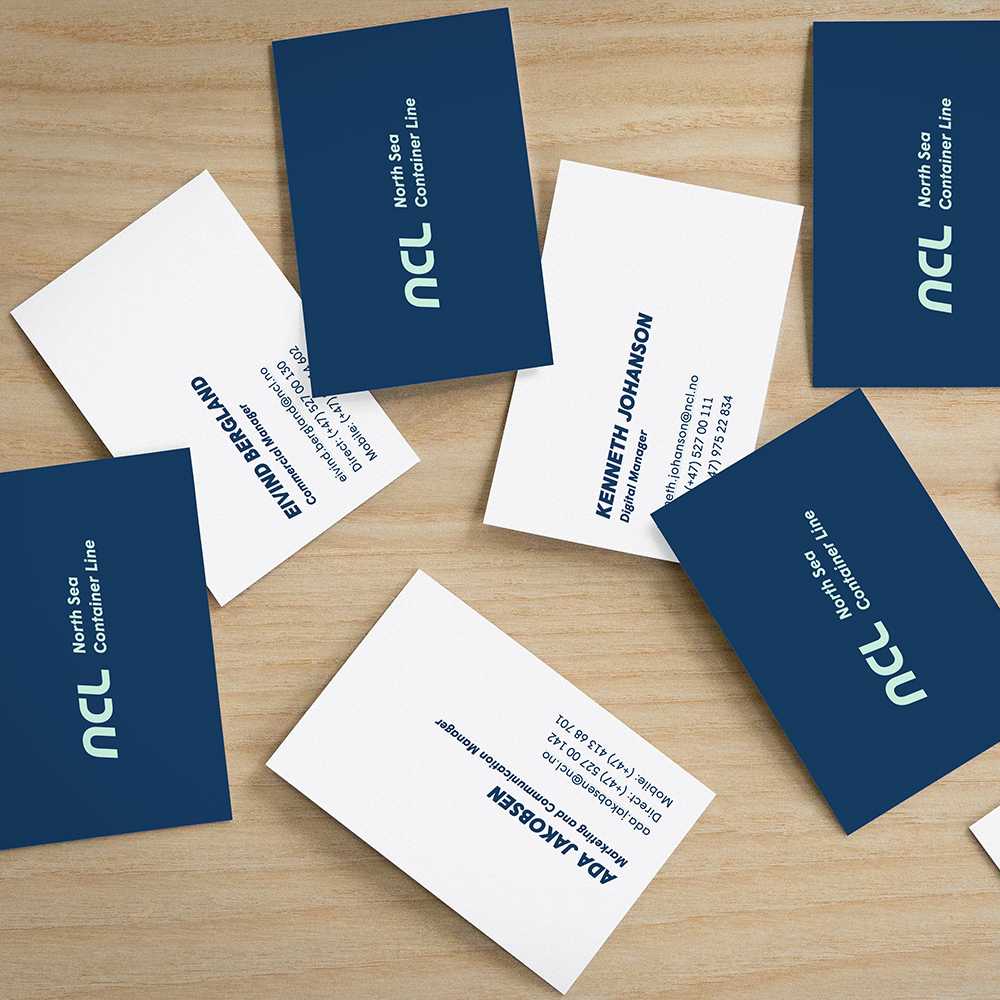
The NCL logotype is one of the most recognizable visual elements in our toolset. The following examples describes how to use the logo to represent NCL in the most powerful and engaging way possible.
The building blocks
We use the the letters N, C and L in a slightly tilted version as our symbol. It's been hand-drawn to harmonize with our primary font, Wigrum. The wordmark is set in Wigrum Bold Italic and reinforces the symbol when needed.
Logo (symbol)
Full logo (symbol + wordmark)
Usage
In our own channels where one could expect that people already know who we are, we only use the symbol logo version. This also applies for smaller devices and screens where space is an issue. In all other settings we use the full logo version with both symbol and wordmark.
Which color version you decide to use is all about context. Use the positive logo version on darker backgrounds and use the negative one on lighter backgrounds.
Make sure you always leave enough white space around the logo.
Downloads
The downloadable files contains both the full and symbol logotype version set in NCL Green, NCL Blue, Black and White. They are all prepared for both print and digital use.
Print (EPS)Digital (PNG)Source files (AI)